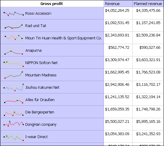
You can use microcharts to improve the visualization of data in crosstabs.
Select a row or column.
From the right-click menu, click Insert Chart for Row Data or Insert Chart for Column Data.
From the Insert Chart dialog box, select a chart and click OK.
Specify the data to plot in the microchart.
The chart automatically plots the data in the specified rows or columns. You can change this if necessary.
You are a report author at The Great Outdoors Company, which sells sporting equipment. You have a crosstab report that shows the revenue and planned revenue for your retailers.
You want to show the trends in gross profit, so you insert a microchart to accompany each retailer.
Open Report Studio with the GO Sales (analysis) package.
In the Welcome dialog box, click Create a new report or template.
In the New dialog box, click Crosstab and click OK.
Expand Sales (analysis), Retailer, and Retailer and drag Retailer to the Rows drop zone.
Expand Sales and drag Revenue and Planned revenue to the Columns drop zone.
Drag Gross Profit to the Measure drop zone.
In the crosstab, right-click Retailer and click Insert Chart for Row Data.
From the Insert Chart dialog box, click a line chart with open, close, minimum, and maximum value markers.
A chart object appears. Now you can plot the data for the microchart
In the Categories (x-axis) drop zone, delete Revenue and Planned revenue.
Expand Time dimension and drag Quarter to the Categories (x-axis) drop zone.
Run the report.
Your report will look like this.

