After you create a chart, you can customize it to suit your needs.
For example, the following chart was customized by:
You can make these and many other changes by changing the default properties of a chart.
You select the element in Report Studio to view its properties in the Properties pane. Some properties are dependent on the existence of other properties.
If you are familiar with using conditional variables, you can customize the chart to change its appearance or provide information in response to expressions or conditions.
When you change a chart property, you usually do not see the change until you run the report. Changes to the properties of labels and titles are reflected immediately.
These are some of the properties you can change in charts. These properties are available when you select the chart object unless specified otherwise in the Action to perform in the Properties pane column.
Goal | Action to perform in the Properties pane |
Hide or show the title, subtitle, or footer | Under Chart Titles, set the Title, Subtitle, or Footer property. |
Hide or show the legend, baselines | Under Chart Annotations, set the Legend, Baselines, Markers, or Notes property. |
Hide or show the axes | Under Axes, set the Y1 Axis, Y2 Axis, or Ordinal Axis property. |
Hide or show the axis title or axis line | Select the y-axis or the ordinal axis. Under General, set the Axis Line or Axis Title property. |
Hide or show the gridlines | Select the y-axis or the ordinal axis. Under General, set the Gridlines or Minor Gridlines property. |
Hide or show the border around the legend | Select the legend icon. Under General, set the Borders property. |
Hide or show the border around the chart object | Under Box, set the Border property. |
Hide or show the tooltips Note: Some versions of Adobe Acrobat Reader do not support tooltips. | Under Chart Labels, set the Tooltips property. |
Change y-axis properties, such as range, scale interval, and so on | Select the y-axis. Under General, set the Minimum Value, Maximum Value, Scale Interval, or Scale property. |
Change the data format | Select the y-axis. Under Data, set the Data Format property. |
Change ordinal axis properties, such as label truncation, skip interval, and so on | Select the ordinal axis. Under General, set the Truncation, Allow Rotation, Allow Stagger, or Allow Skip property. |
Change the white space around the chart | Under Box, set the Padding or Margin property. |
Change the color or pattern in the palette for columns, lines, and areas | Under Color & Background, set the Palette or Conditional Palette property. |
Apply a palette to a series | Under Color & Background, set the Series Color property. |
Change the default color or font | Under Color & Background, set the Background Color, Foreground Color, or Fill Effects property. Under Font & Text, set the Font or Relative Alignment property. Tip: The
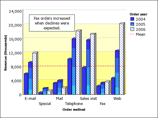
2005 Quarterly Sales Forecast sample report |
Override the default font or color for axes and chart values | Click the lock button |
Resize the chart | Under Positioning, set the Size & Overflow property. |
Change the three-dimensional appearance of a chart | Under General, set the Depth or Visual Angle property. |
Insert a background image or watermark in the chart body, which is the space between the axes | Click the lock button in the toolbar to unlock the chart object, select the chart body by clicking between the axes, and set the Background Image property. |
Insert a background image or watermark in the chart object | Under Color & Background, set the Background Image property. |
Go to another report | Under Data, set the Drill-Through Definitions property. |
Specify which labels and values to use when generating the text shown on the chart | Under Chart Labels, set the Values property. Note: When you show all the labels and values on some chart types, such as scatter charts, bubble charts, and polar charts, the text shown may be too long. |
Select the chart or chart element to change:
To change general properties, such as size and color, select the chart object.
To change specific chart elements, such as a title or axis, select the element itself.
Tip: To cancel a selection, press the Esc key.
In the Properties pane, set the property value.
An ellipsis (...) button indicates that a dialog box provides further options.
You may have to scroll to see all the properties.


 in
the toolbar to unlock the chart object, select the chart body by
clicking between the axes, and set the Font, Background
Color, Foreground Color, or Fill
Effects property.
in
the toolbar to unlock the chart object, select the chart body by
clicking between the axes, and set the Font, Background
Color, Foreground Color, or Fill
Effects property.