Create a Win-Loss Chart
You can use win-loss charts to visualize win-loss trends.
A win-loss chart is a microchart in which the value of each column
is either 1 or -1, often denoting a win or loss.
Win-loss charts use two measures (the default measure and the
win-loss measure) and no series.
Note
Axis lines are not shown for win-loss charts in Excel output.
Steps
In Report Studio, from the File menu,
click New.
In the New dialog box, click Chart,
and then click OK.
In the Chart group pane, click Microchart.
In the Chart type pane, select the
win-loss chart, and then click OK.
In the Insertable Objects pane, on
the Source tab  , click a data
item to add to the chart, and drag it to the Categories
(x-axis) drop zone.
, click a data
item to add to the chart, and drag it to the Categories
(x-axis) drop zone.
Drag a measure, query calculation, or calculated member
to the win-loss section of the Measures drop
zone.
Note: If your win-loss calculation specifies a measure,
you may not need to define a default measure.
Click the chart
object.
In the Properties pane, under General,
specify a value for the Win-Loss Threshold property.
Run the report.
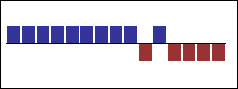
Example - Create
a Win-Loss Chart
You are a report author at The Great Outdoors Company,
which sells sporting equipment.
Using the GO Sales (analysis) package, you want to create a win-loss
chart that shows whether the gross margin is above a certain threshold.
Quarters where the gross margin is greater than 10000 are represented
as wins. The rest are represented as losses.
Steps
Open Report Studio with the GO Sales (analysis) package.
In the Welcome dialog box, click Create
a new report or template.
In the New dialog box, click Chart,
and then click OK.
In the Chart group pane, click Microchart.
In the Chart type pane, select the
win-loss chart, and then click OK.
From Sales in Sales (analysis),
drag Margin to the win-loss section of the Measures drop
zone.
From Time dimension in Sales
(analysis), drag Quarter to the Categories (x-axis) drop
zone.
Click the chart
object.
In the Properties pane, under General,
specify 10000 as the value for the Win-Loss Threshold property.
Tip: Alternatively, from the Toolbox tab
you can drag a calculated member or query calculation to the win-loss
section of the Measures drop zone and use the
Expression editor to create a calculation.
Run the report.
Your report will look like this.